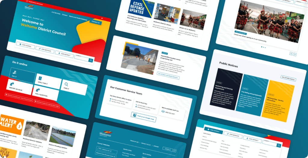
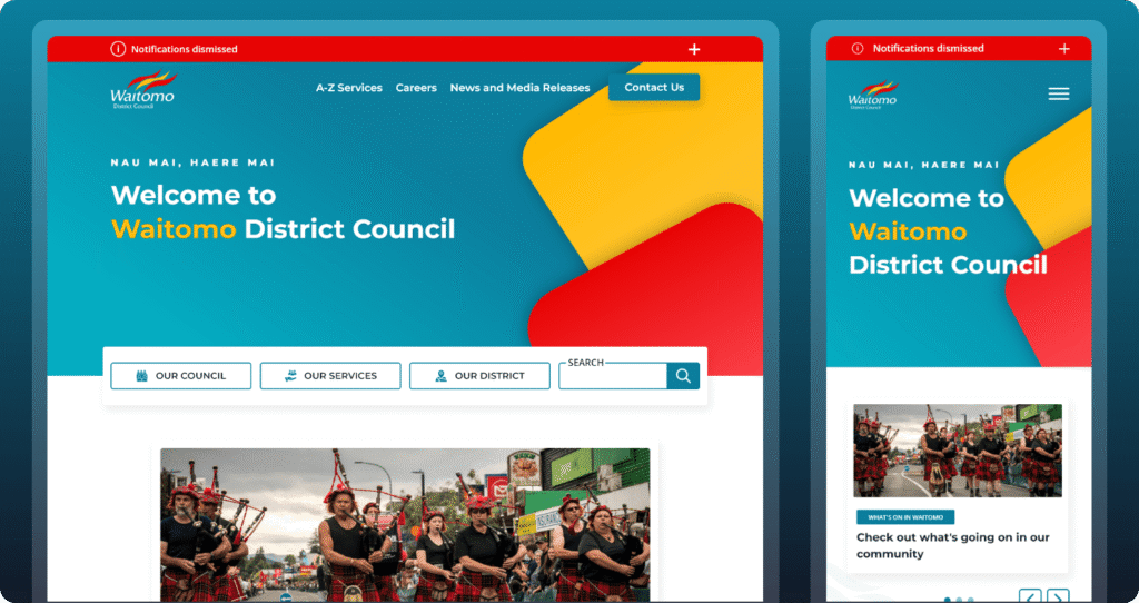
Waitomo District Council needed more than just a facelift—they required a website that could serve as the heartbeat of their community. The goal was to create an accessible, user-friendly, and visually compelling platform that could meet the needs of residents, visitors, and council staff alike.
Client:
Waitomo District Council
My Role:
Creative Lead, Guru Digital Agency
Services:
UI/UX Design
Key Design Features & Benefits
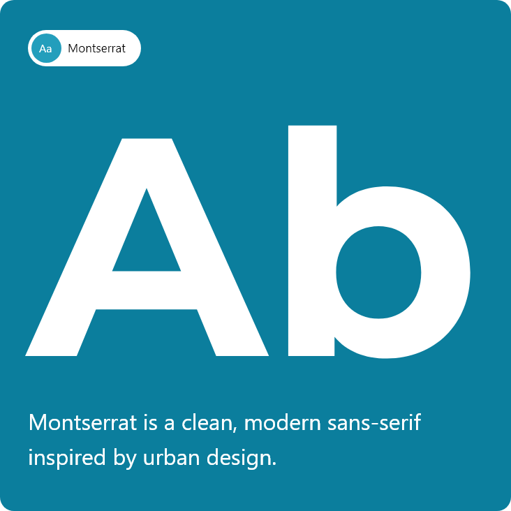
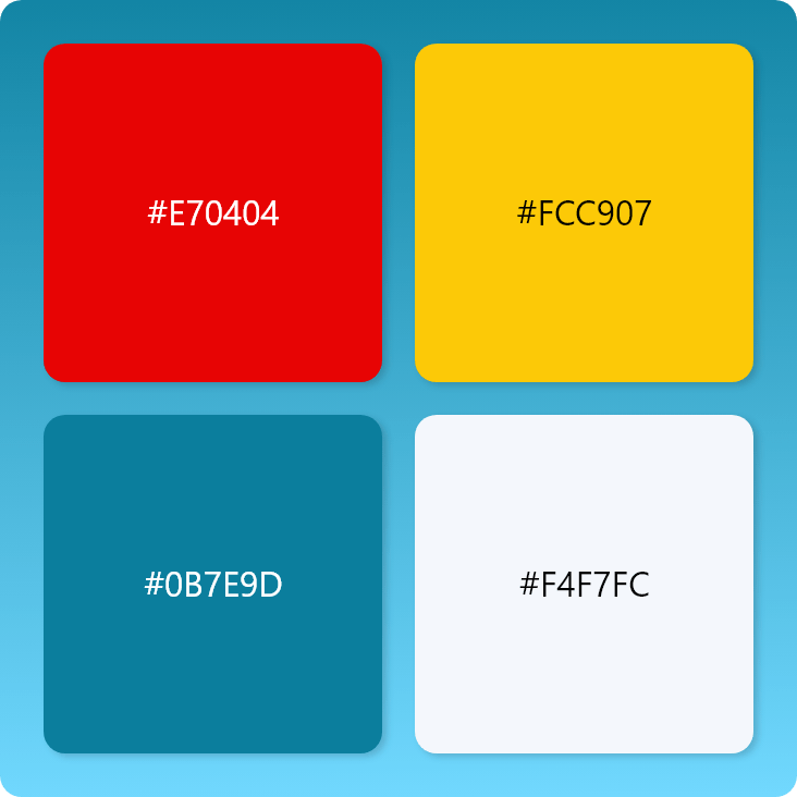
Modern Visual Identity A refreshed color palette and typography system build trust and make the brand instantly recognizable.
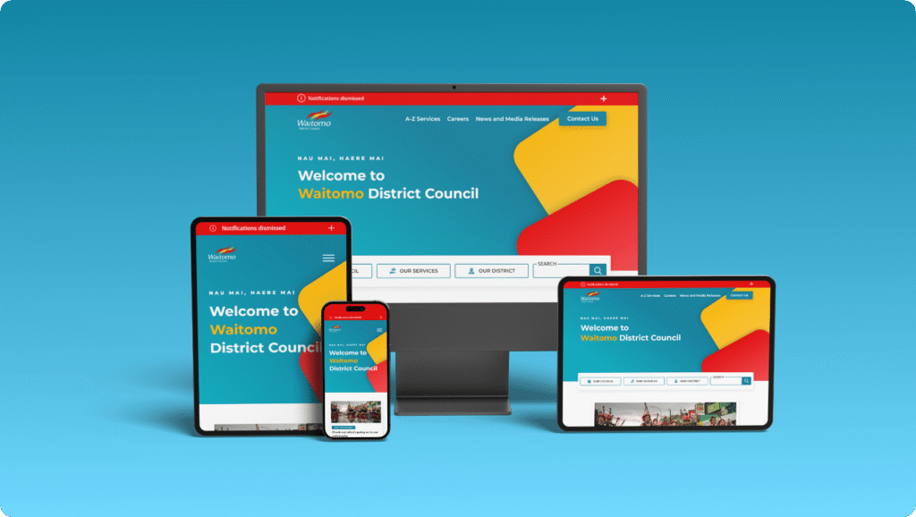
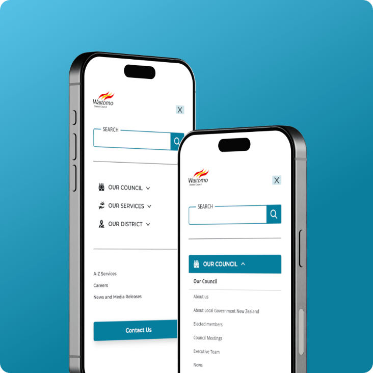
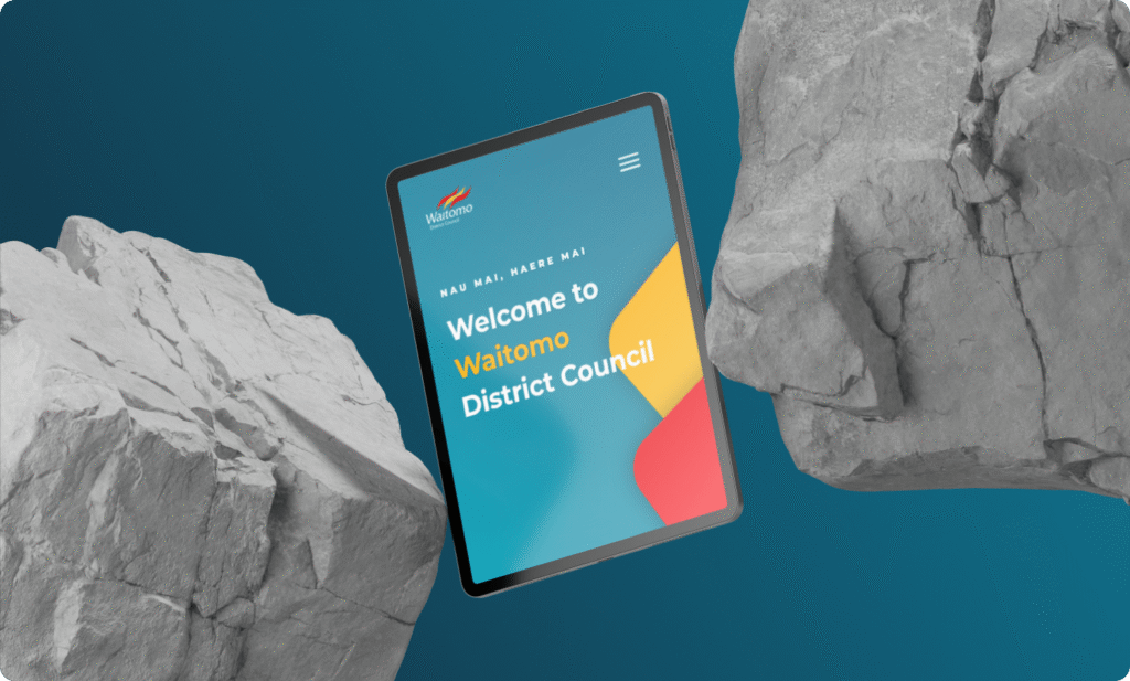
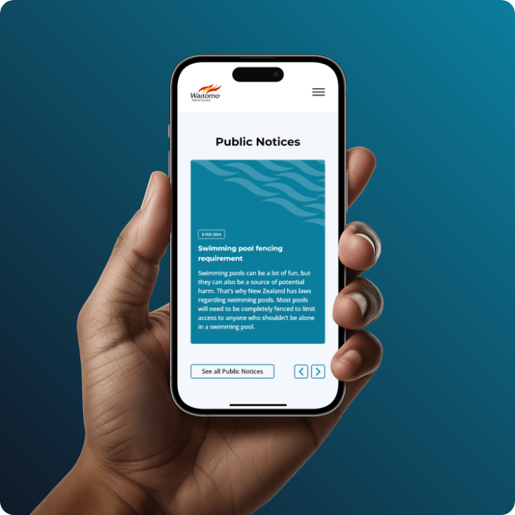
Responsive & Accessible Layouts Residents can access services anytime, anywhere—whether on mobile, tablet, or desktop.
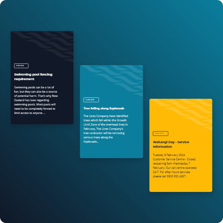
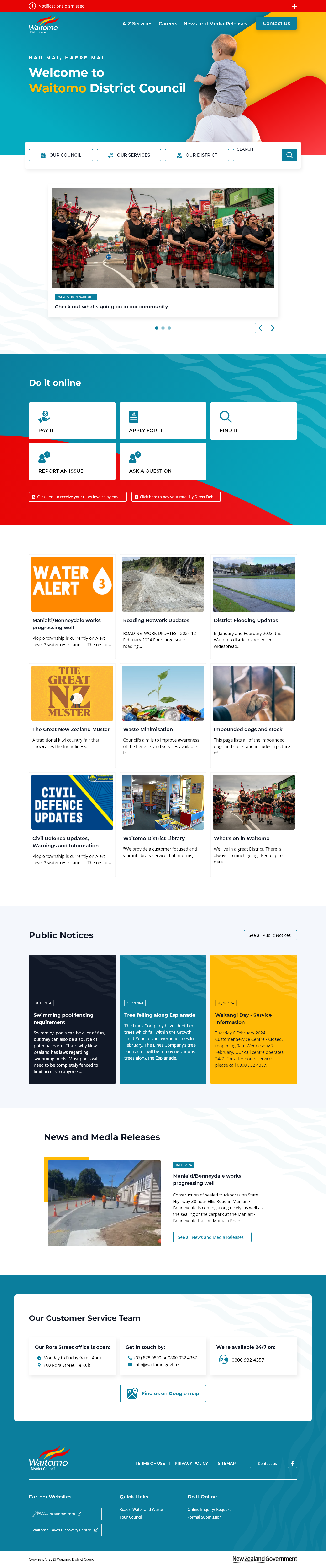
Community Alerts & Event Highlights Critical updates like weather alerts or local events are displayed front-and-center to keep citizens informed.
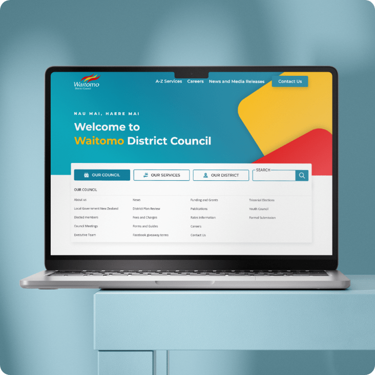
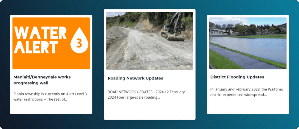
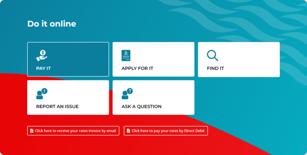
Service Finder & Navigation Cards Quick, visual access to high-demand services means fewer clicks, faster results, and happier users.
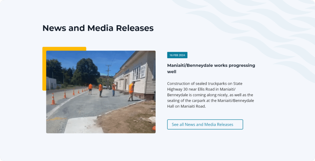
Integrated Multimedia Support The design supports rich images, videos, and interactive maps to make content more engaging.
Brand & UI Style Guide
“Consistent colors, typography, and visual elements create instant recognition.”
"A fresh, modern face for Waitomo—built for clarity, speed, and community pride."
Responsive Layouts
“Seamless browsing on desktop, tablet, and mobile—no resident left behind.”
Event & Alert Modules
“Urgent updates and community news are now front-and-center.”
Service Finder & Navigation Cards
“Quick access to the most-requested council services and information.”
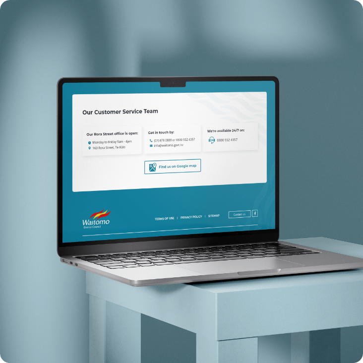
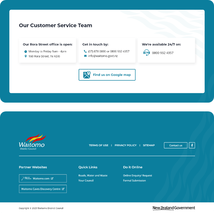
Map & Location Features
“Helping residents and visitors find key locations faster.”
Final Word
The Waitomo District Council website now serves as a true digital home for its community—clear, engaging, and accessible to all. By blending modern design with practical usability, the council can better connect with the people they serve.